The dashboard features a high-level overview of data related to vaccinated populations, doses required to reach targets, estimated pre-purchased doses, daily vaccination rates, and daily COVID test rates. Visitors can drill down deeper into the data to find the country breakdowns related to the overall COVID-19 situation, financing gaps, dose donations from donor countries, and more. The database country-by-country dashboards has the goal of spotlighting the main country-level constraints, challenges, and gaps, and the support needed to get those countries back on track.
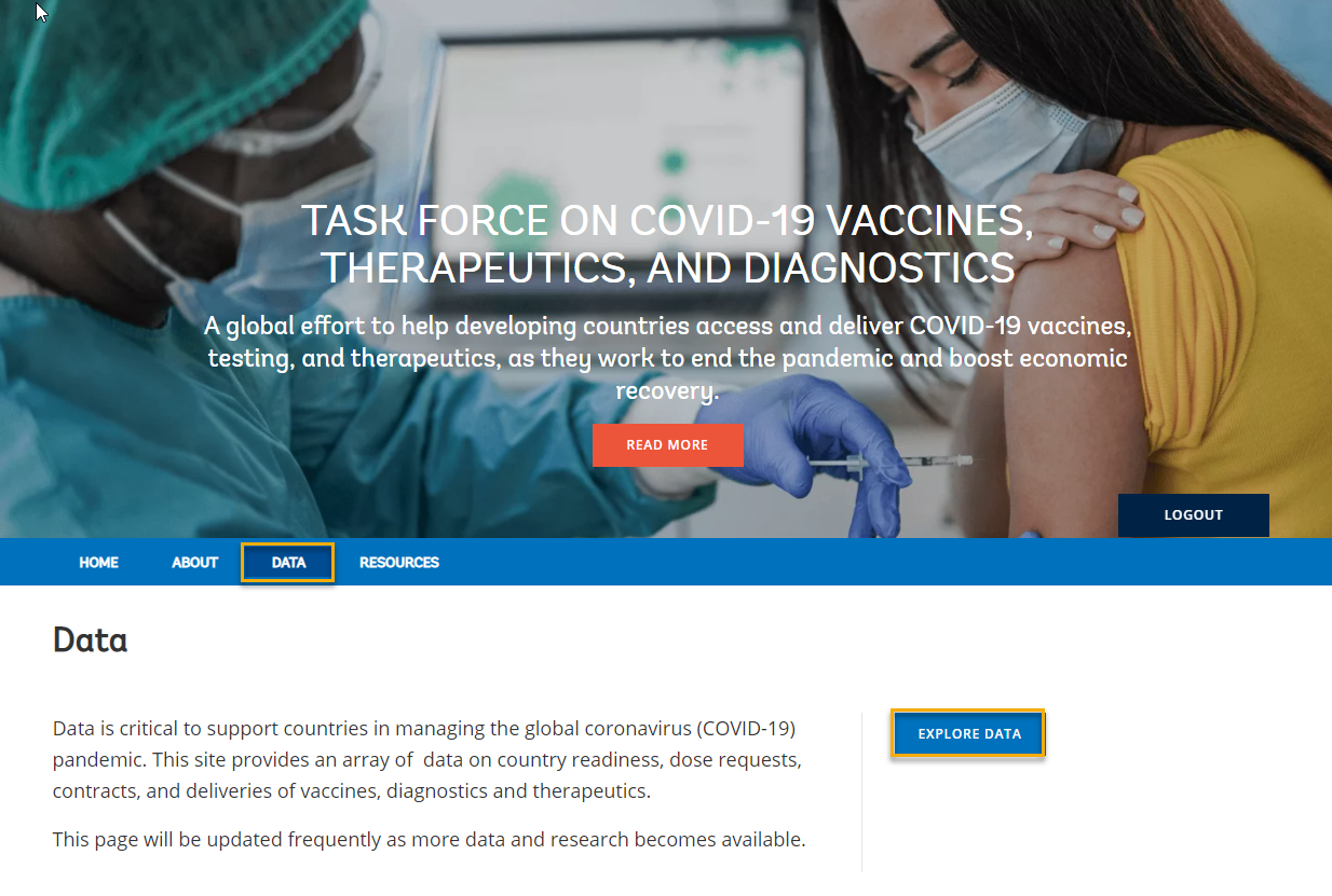
Visitors access the dashboard by selecting the Data tab from the main Task Force website and then clicking the Explore Data button.
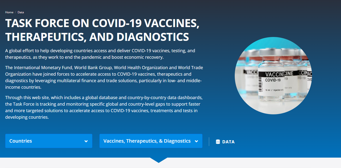
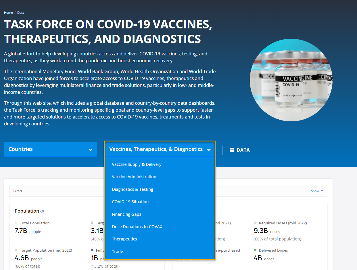
The dashboard is organized into two main sections – Countries and Vaccines, Therapeutics, & Diagnostics – with a link to Data tables. Links to Task Force member organizations are available and tabs to the main Task Force website (Home, About, Resources) provide easy navigation. Throughout the site, visitors can click on the blue help “?” for more information about that item.
1. The main landing page provides a global overview of the following:
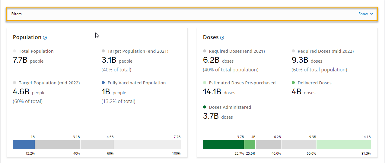
- Population and Doses information is represented in a simple card style with bar graphs showing progress toward defined goals. The filter allows visitors to select one or multiple countries.
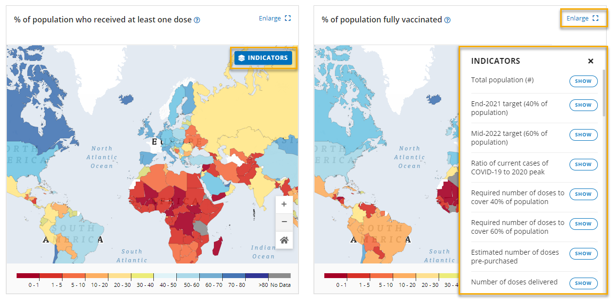
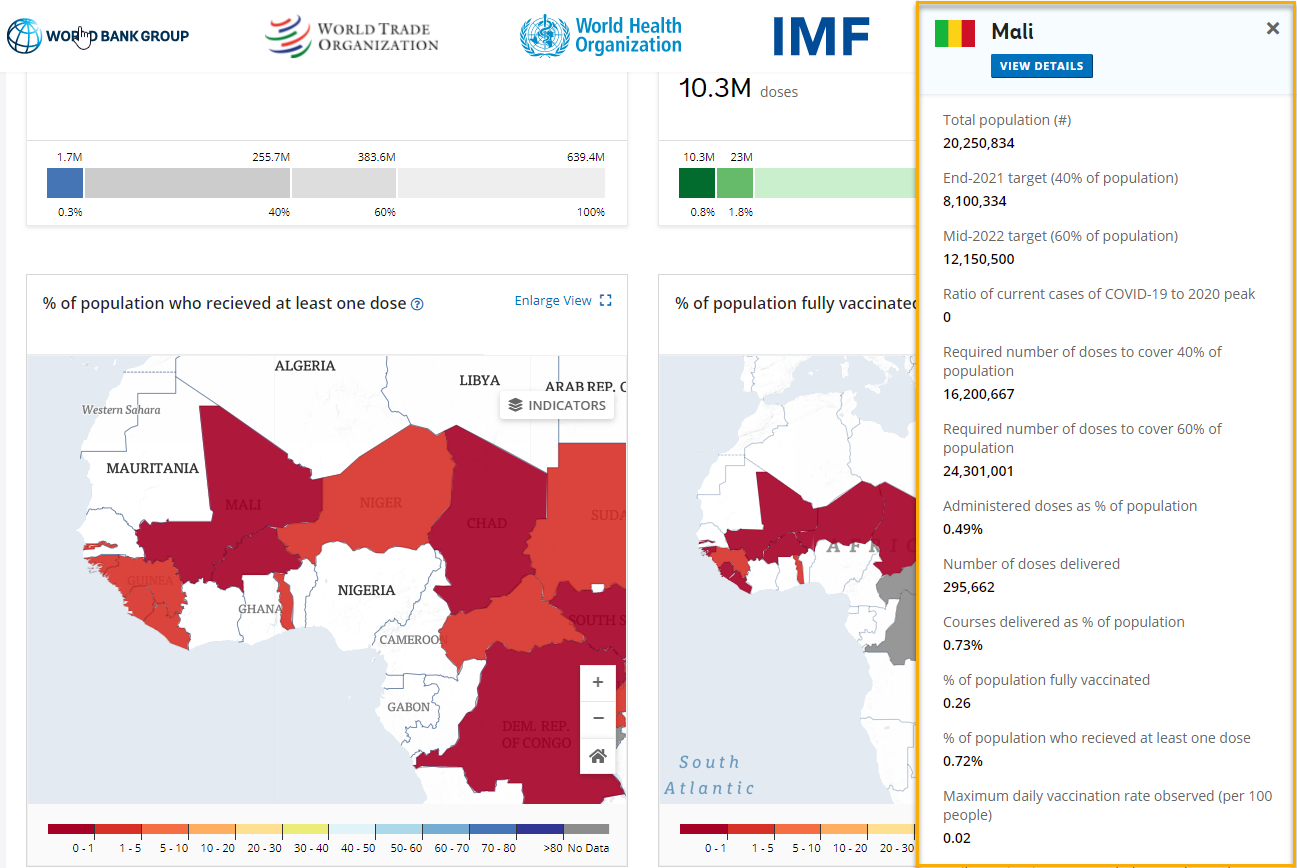
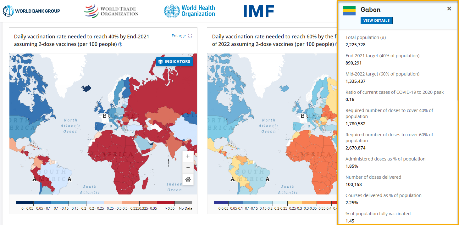
- The next two items on the dashboard are interactive maps showing “% of population who received at least one dose,” and “% of population fully vaccinated.” Visitors can select Indicators to choose which to display on the map and can click on Enlarge View to expand to full-screen. Clicking on a country will open an information panel about that country, with the option to View Details for an even deeper dive.
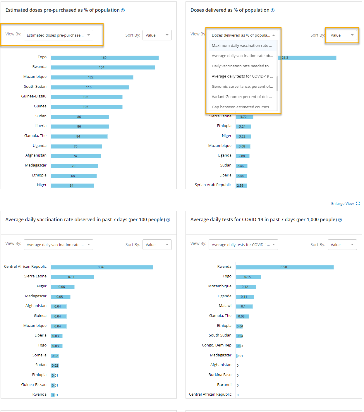
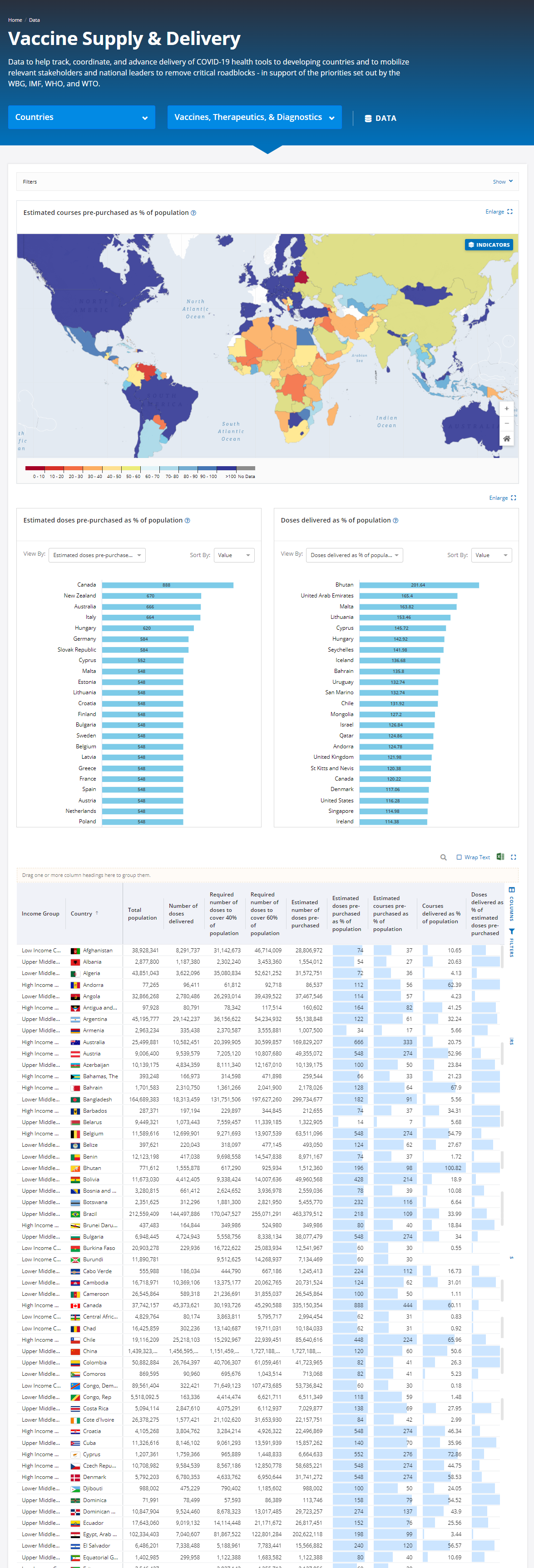
- Next are four interactive bar graphs showing “Estimated doses pre-purchased as % of population,” “Doses delivered as % of population,” “Average daily vaccination rate observed in past 7 days (per 100 people),” and “Average daily tests for COVID-19 in past 7 days (per 1,000 people).” Visitors can select the View By dropdown arrow to see a series of options and sort the data by value or by country. Hovering over any blue bar will highlight the information for that country.
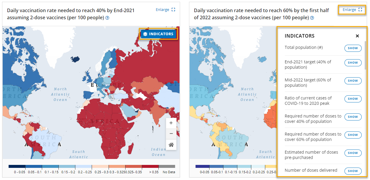
- The final two items on the main landing page are interactive maps showing “Daily vaccination rate needed to reach 40% by end-2021 assuming 2-dose vaccines (per 100 people),” and “Daily vaccination rate needed to reach 60% by the first half of 2022 assuming 2-dose vaccines (per 100 people).” Visitors can select Indicators to choose which to display on the map and can click on Enlarge View to expand to full-screen. Clicking on a country will open an information panel about that country, with the option to View Details for an even deeper dive.
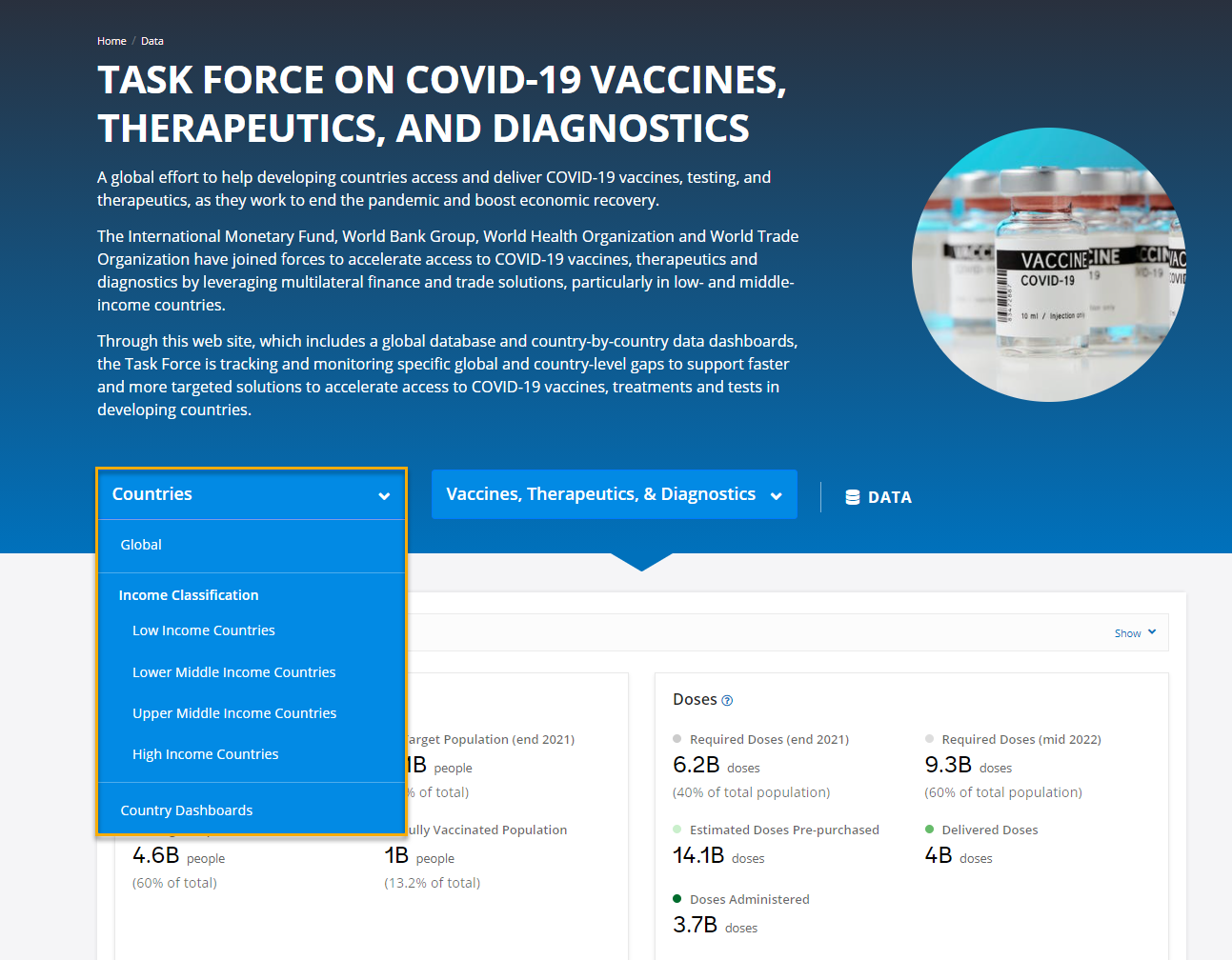
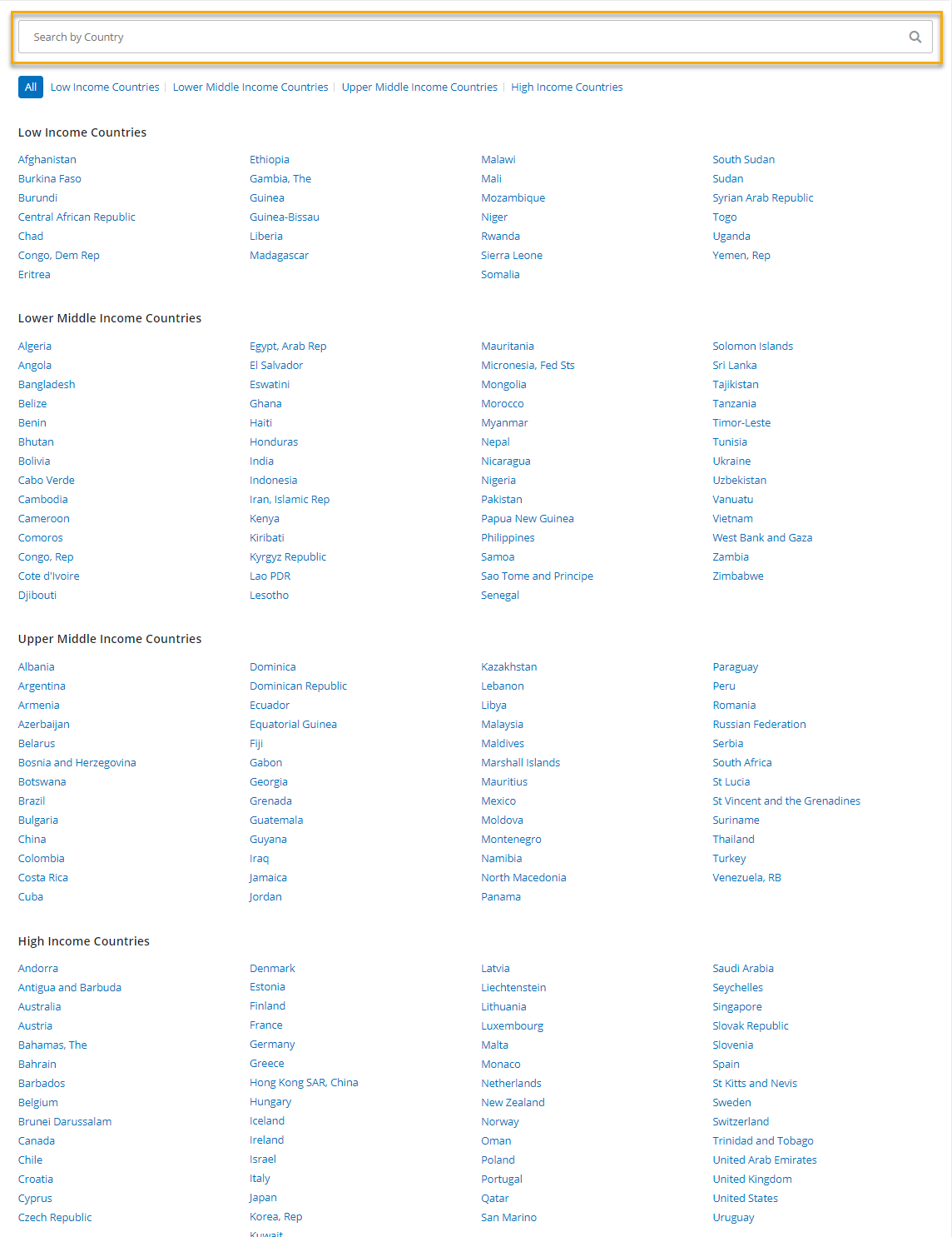
2. The Countries dropdown menu allows visitors to choose how to view the information above: Global or by Income Classification (Low Income, Lower Middle Income, Upper Middle Income, High Income). There is also a link to Country Dashboards which takes you to a simple wayfinding page with an alphabetical list of countries grouped by income category. Visitors can use the search bar to jump straight to a specific country.
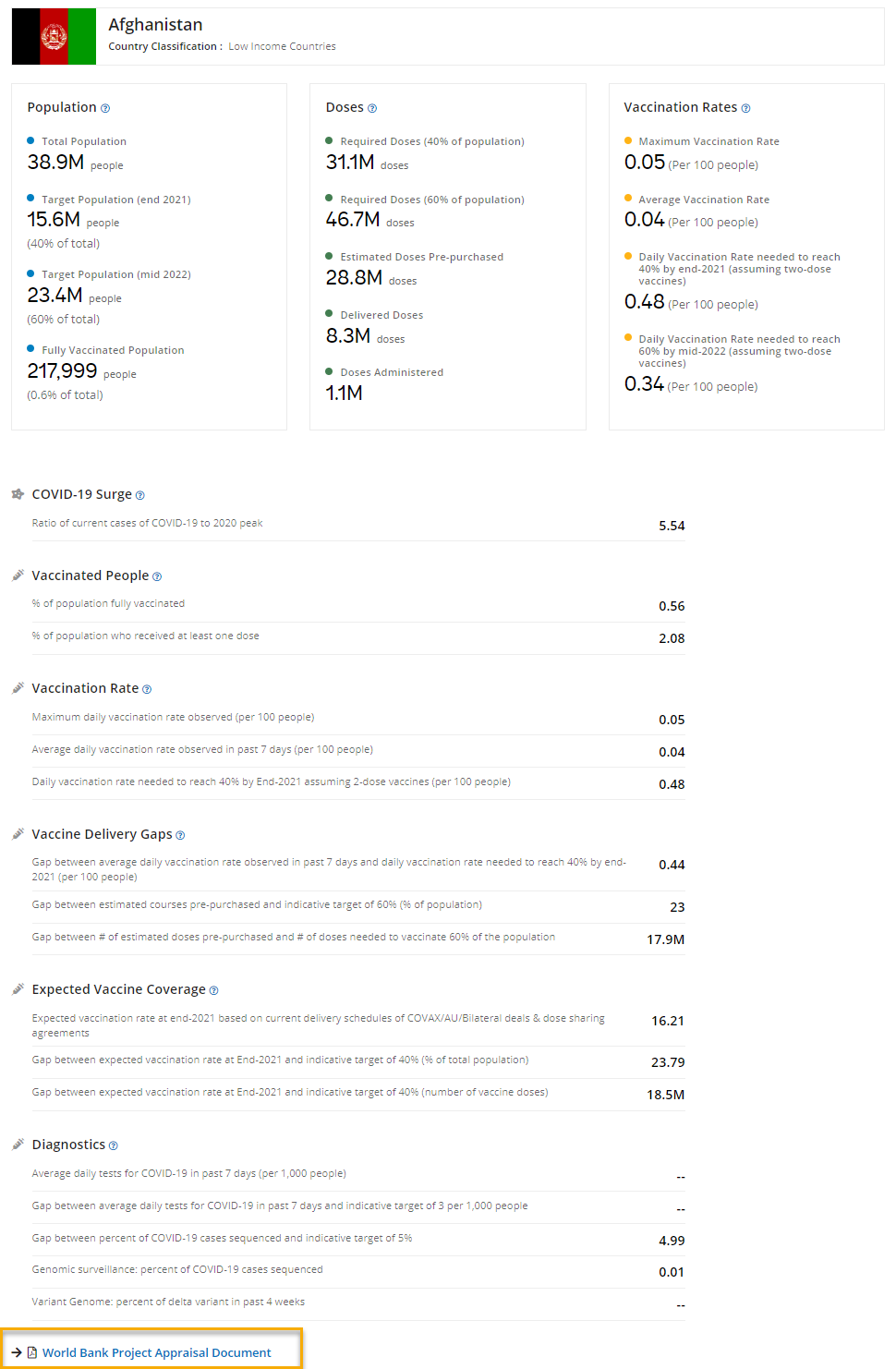
Clicking on a country name will open a detailed country listing page. This page displays Population, Doses, and Vaccination Rates in a card format followed by a table with information on COVID-19 Surge, Vaccinated People, Vaccination Rate, Vaccine Delivery Gaps, Expected Vaccine Coverage, Diagnostics, and a link to the World Bank Project Appraisal Document (if applicable). Again, visitors can click on the blue help “?” next to each title for more information, such as a definition.
3. The Vaccines, Therapeutics, & Diagnostics dropdown menu allows visitors to choose a category for deeper exploration: Vaccine Supply & Delivery, Vaccine Administration, Diagnostics & Testing, COVID-19 Situation, Financing Gaps, Dose Donations to COVAX, Therapeutics, and Trade.
For each of the following categories - Vaccine Supply & Delivery, Vaccine Administration, Diagnostics & Testing, COVID-19 Situation – visitors will see an interactive map, two interactive bar graphs, and a data table.
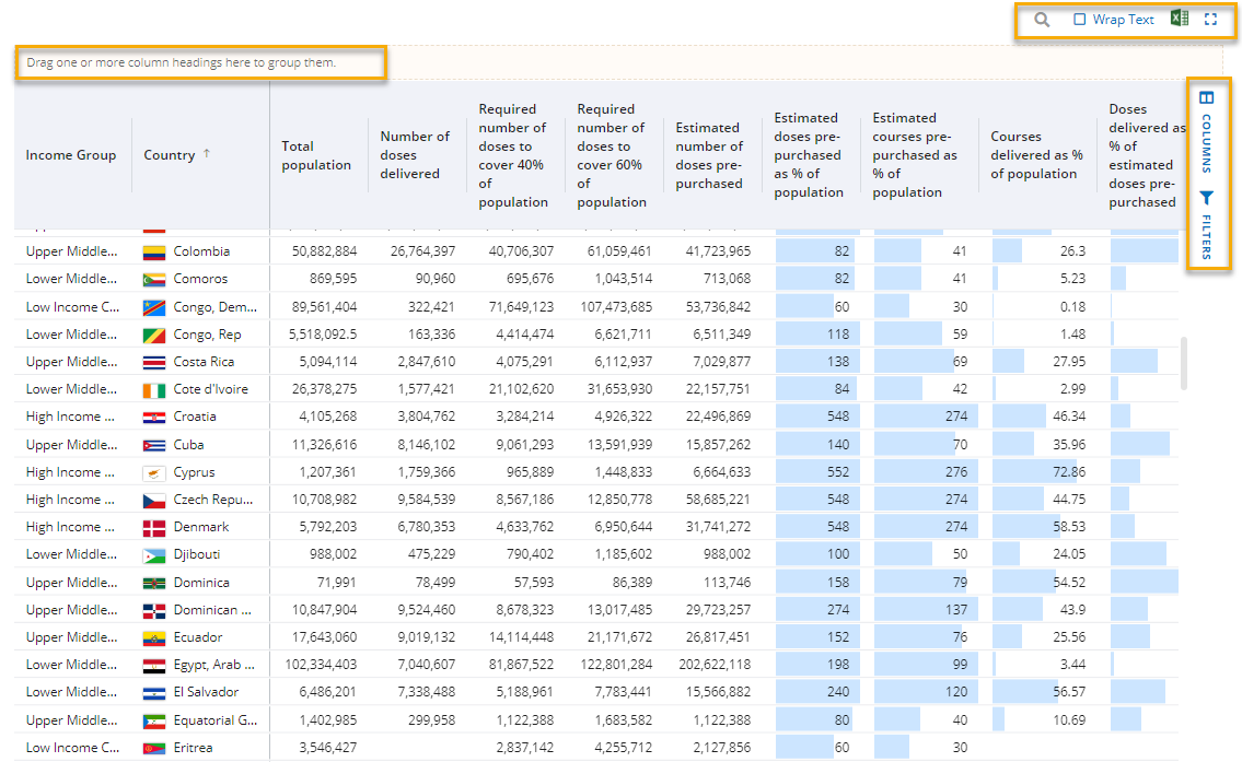
4. The Data button provides a link to all data tables within the site: COVID-19 Situation, Vaccine Supply & Delivery, Vaccine Administration, Financing Gaps, Dose Donations to COVAX, Diagnostics & Testing, Therapeutics, and Trade.
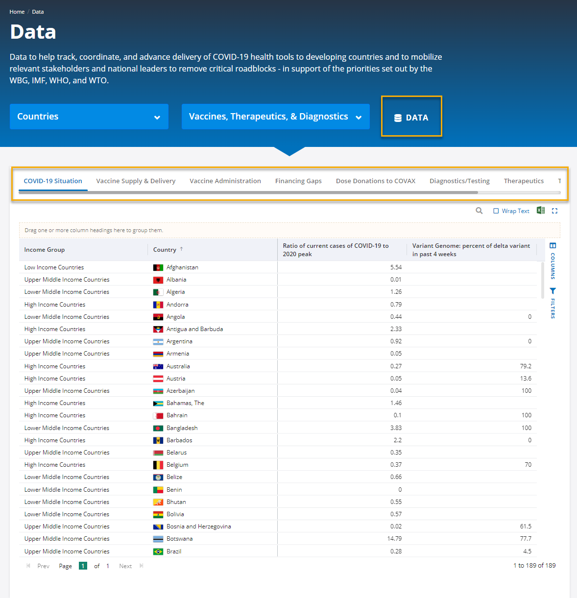
For each table, you can drag and drop a column header – for example, Income Group, into the yellow shaded area to group data by that category. Clicking on a column header will change the sort order. The Columns and Filters sections provides options to view the data, while Search allows visitors to quickly jump to a certain country or item. Visitors can also download the data into an Excel file with one click.